 an alligator under a whale under a shark beneath a cloud toxic flowers under sparkling spray waters abound sticky tape pulls and tears ink hisses a little too loudly ah, some of these are quite damaged i don't come cheap even my seconds arrive first big prints little prints from canvas to cardboard ink that won't dry someone she admires you were part of my child hood when you made the smear on your beard you gambled you lost in the depth the clouds can rain directly on the crocodile on the crocodile grin 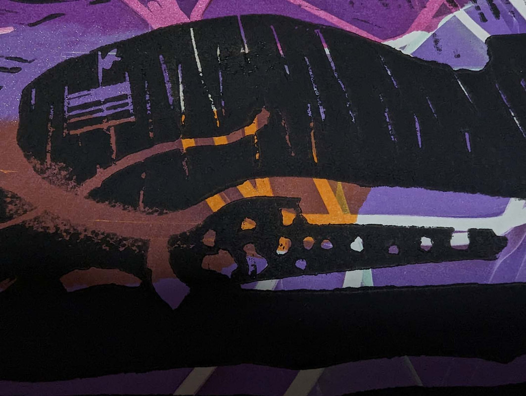
0 Comments
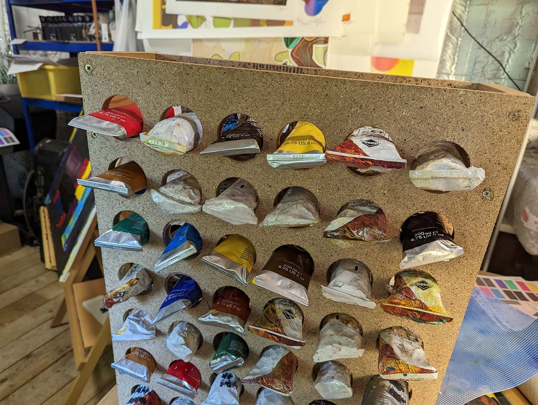 I had started to feel a loathing for the tubes of paint lying around my studio. I want to use the colour I chose, not the one that's at the top of the pile! The problem is that paint is hard to manage if you have more than a few tubes. If you Google search for paint organisers for 200-ml oil paint tubes, you won't find many. There are some cool Etsy ones, but they appear to be only for small pots of acrylic paint. There were a couple of chipboard sheets lying around. One was far too thick, but I used it anyway! That was a costly mistake. I cut a length of pine into four sections to divide the sheets, and I pre-drilled the screw holes. There was a bit of planning involved. I had to make sure that the tube would go through the hole. It wouldn't crimp end first, but it went in nicely cap end first. The hole-drilling was a bit of an adventure. I realised too late that the teeth on the circular hole drilling thing had become quite worn through previous jobs. I borrowed my brother's drill for this. Because the teeth weren't sharp, there was a lot of friction and not much cutting. On the second thicker sheet, I noticed first that the drill was slowing down a bit, second that smoke was coming out of the drill itself, and third that sparks were flying out of it. I'm currently searching eBay for a replacement! So here you have two slide shows: one of the making and one of the finished job. I can paint some daubs above each tube as a guide to the colours. I'm quite pleased with it, but when all the paint is in place, the whole thing is very heavy. Maybe tomorrow I'll screw a couple of small sections of wood to the bottom to stop it from tipping over. Another nice thing is that the paint tubes seem happy when they are just pushed into three quarters. Some flattened ones need a bit of a squeeze. The cool thing is that I can make more and extend this. What do you guys do with your myriad paints? KR ICW  Where there is a process to making art that simply involves following instinct, with no desire to imagine any particular fate for that "work of art" there seems to be an increased chance of it failing to hit any particular buttons, or fall into pre-defined categories.
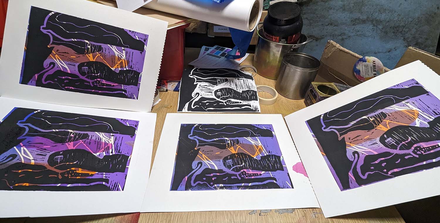
I realised a week or two ago that what I'm making lately are in fact Digital Monoprints. This one I have titled Left Side Brain, because what you see in the foreground is structured and controlled in a way with its predefined shapes. and its semi-organised format, the background is definitely right side brain! Isn't it nice to just play? I have worked hard to achieve this method, but the final image is a source of joy sometimes! It's not reproducible, so it's a one-off. I could attempt to scan it and reproduce it for prints, but I'm frightened of scratching it with the scanner rollers. Don't laugh - It happened once. There was a lump of paint that was kind of standing proud, and it got caught and made a tram-line across the entire image! So my output has changed from Limited Edition prints to Digital Monoprints! I was never too comfortable with all that limited edition nonsense. It's a bit of a joke unless and until everyone knows your name... Ian Clegg Walsh !!! |
|
 RSS Feed